
 I got the idea for this project after my last trip to the beach. I've always wanted to paint shells, but felt intimidated by the prospect and not really sure what medium I should use. The topic of interesting interiors seemed like a great opportunity to give it a try.
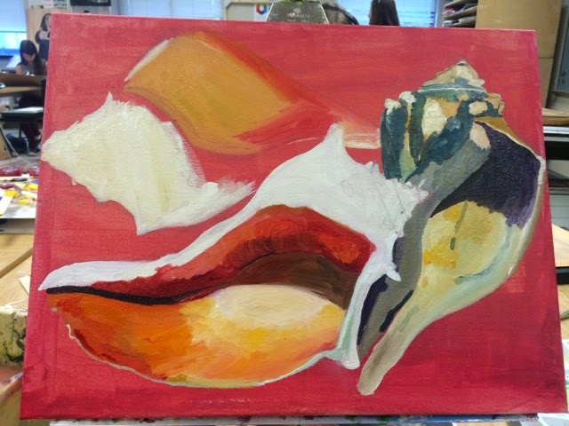

I started off with a reddish acrylic wash. I then went in and put in the lighter values, and blocked off areas of different colors. I started with the shell on the right hand side and had the most difficulty with that one. I found that there were lots of different colors in the shell and I was having difficulty tying them all together so that the shell looked realistic. I found that the key to that was to make sure that the blotches of color followed the curves of the shell, and I had a lot less difficulty with the next two shells. I definitely felt more confident using the oils this time than I had for the previous painting and I tried to be more strategic about which areas I painted in what order. I really liked how vibrant the colors turned out, especially on the interior portions of the shells. I decided to paint the background a warmer and softer shade than in my reference picture. I deliberated between a violet and a reddish brown, but I decided to try a reddish brown, and I really like how it ties the whole painting together.
I really liked using oils for this piece. I definitely planned this piece out better than my previous one, and so I didn't run into the problem of making muddy colors like I did with my previous painting of the tennis balls. Using the oils for this piece enabled me to easily blend the different colors present in the shells and achieve the smooth look that I wanted.


No comments:
Post a Comment