Saturday, December 13, 2014

Project 10: Colored Pencil Magazine Bow Challenge

Our homework assignment for the past month has been to complete the monthly Colored Pencil Magazine Challenge, which for the month of November was a photograph of Christmas bows. In the beginning, I wasn't too excited about the prospect. However, once I started, the bows were a lot of fun. I decided to crop the image because the entire picture depicted many bows, and I preferred to do fewer bows and make each bow larger. 

I really enjoyed the vibrant colors of the bows. I found sketching them out to be tedious but once it came to blocking in the colors and highlights I began to enjoy the project a lot more. The black paper really made the colors appear even more bright, although in turn I wasn't able to push the highlights as much as I would have liked. 

The most challenging bows were the metallic colored ones. While I have both a gold pencil and a silver pencil, they were both darker than the shades shown in the photograph. I added white to both, but that diminished the metallic qualities. In the end, the gold and silver bows were somewhat metallic looking, but not to the extent that I'd desired.

Project 7: Landscape

The scene depicted is of Fisherman's Bastion in Budapest, Hungary, right off of the Danube River. I've liked this photograph for a long a time and have considered making a piece inspired by it, but I have always been intimidated by the level of detail. That being said, I was at first hesitant to choose this subject as my landscape. I wanted this piece to be quicker piece and I was worried that the details in this photo would inhibit my intentions. I ended up simplifying the stonework of the structure in my original sketches which made the whole prospect seem much more doable.

 I chose to do this piece in watercolor because I hadn't worked in that medium yet this year. I started off by doing some rough sketches in my notebook.  I really enjoyed the loose quality of water colors, that a few expressive colors in key places could have a great impact. The color scheme of the photograph  was also very interesting to work with. It contained a wide range of blues, rich brick reds in the distant city, and vibrant greens in the close up trees.

After lightly sketching the scene, I began by blocking off the areas in the clouds I wished to leave white and by putting in a blue wash over the rest of the sky. I then put in the distant mountains and forests as well as the buildings, for which I put in warm light browns and red roofs. I moved my way toward the foreground, using lots of layers of green in varying shades and hues to give the trees depth. The building itself I painted last. I first did a light gray wash over the whole thing and then went back and placed in the dark grays. 

Overall I am happy with the piece. There are a few areas that turned out darker than I would like them to be and I would like to have sharper edges in some places. On the whole though,  I really enjoyed this process. Watercolors were a nice break from oils and I'd like to paint something in them again soon.


Tuesday, December 2, 2014

Project 5: Self Portrait

This project took a lot longer than I had anticipated for a few reasons. I'm not super confident in drawing figures/faces, so that to begin with made the project a little bit challenging. Sketching and feature placement took me a long time, but I finally got the sketch where I wanted it. Initially I had intended to do my self portrait in oils, but I wasn't fond of the colors I had chosen and I got a little frustrated with the whole thing. I then switched gears and decided to do my portrait in stippling. I'd done a large landscape in stippling in art two, and really enjoyed it even though it was very time consuming. I really like the range of value and the detail that can be achieved with stippling.

The most challenging part of this project was definitely capturing myself accurately. Even though my drawing was pretty accurate, my initial placement of the shadows seemed to distort some of my features, especially my nose. I went back in and deepened the shadows, and that made my features appear more proportional. I had to go back and push the dark values several times, but now I am happy with the contrast. Overall, I am pretty happy with the end result. I definitely feel more confident about rendering portraits as well as stippling.


Tuesday, October 28, 2014

Project 4: Frog on Windshield

Practice 


The theme that I chose for this piece was up close and personal. Seeing this frog on the windshield really jumped out at me, as it was a small and unexpected burst of color. I chose to use Prisma Colors for this piece because of how easily they blend and how vibrantly colored they are.

I really enjoyed using the Prisma Colors. I was able to blend them really easily and I liked the range of values and colors that I was able to capture. My favorite part of this piece was pulling together all the different values and colors in the frog. I like how you can layer and use exaggerated colors with the colored pencils. I was frustrated with the background, as the paper kind of rubbed off as I put in the blues and whites. I ended up with the desired texture for the frog but not so much for the background.  In the future I'll definitely plan out the background differently because I'm not crazy about how visible the texture of the background is.I plan to put in more dark values in the background, likely pulling in violets from the frog in order to give the piece more depth, and I also want to try to pull in more of the texture from the windshield (as in water droplets).


Tuesday, October 21, 2014

Project 2: Interesting Interiors


I got the idea for this project after my last trip to the beach. I've always wanted to paint shells, but felt intimidated by the prospect and not really sure what medium I should use. The topic of interesting interiors seemed like a great opportunity to give it a try.


I started off with a reddish acrylic wash. I then went in and put in the lighter values, and blocked off areas of different colors. I started with the shell on the right hand side and had the most difficulty with that one. I found that there were lots of different colors in the shell and I was having difficulty tying them all together so that the shell looked realistic. I found that the key to that was to make sure that the blotches of color followed the curves of the shell, and I had a lot less difficulty with the next two shells. I definitely felt more confident using the oils this time than I had for the previous painting and I tried to be more strategic about which areas I painted in what order. I really liked how vibrant the colors turned out, especially on the interior portions of the shells. I decided to paint the background a warmer and softer shade than in my reference picture. I deliberated between a violet and a reddish brown, but I decided to try a reddish brown, and I really like how it ties the whole painting together.

I really liked using oils for this piece. I definitely planned this piece out better than my previous one, and so I didn't run into the problem of making muddy colors like I did with my previous painting of the tennis balls. Using the oils for this piece enabled me to easily blend the different colors present in the shells and achieve the smooth look that I wanted.


Monday, September 29, 2014

Project 1: Prismacolor Final

I'd never really thought about using colored pencils before doing this piece, and when we started the project I was honestly a little bit intimidated by the prospect. After making several practice sketches and blocking out the colors, I felt pretty confident in beginning. I started with the reflection of the chair and the bear in the pendulum, using lots of golds and oranges and yellows to give it a warm look (while leaving room for the chains in the background). The next step was to add in the chains. During previous sketches I had had difficulty in making the chains pop out from the paper and the background. Mrs. Rossi suggested using a blue to emphasize the shadows. I really liked how the blue not only made the chains pop from the warm yellowy-orange background, but also tied in the blue that was in the rocking chair to the rest of the picture. The chains were easily the most time consuming part and I did get a little bit frustrated with them, especially the smaller two chains on the left, but I am really happy with how they turned out. After I completed the chains, I put in dark values for the foreground and the wall in the background, mostly dark browns with little bits of whites and greens to add variation.

I had a great time with this project and definitely look forward to using colored pencils again. I really like the bold colors you can achieve with the Prismas and the great variations in texture that are possible as well. Another aspect of the Prismas that I really like is their ability to be layered. Not only does this enable you to achieve very rich and varied colors, but by layering the same or similar colors on top of each other throughout a piece,  you can really create a color scheme that ties the whole piece together.

Sunday, September 21, 2014

Practice with oils


This was the first time I had ever used oils before. I really like acrylic paint and I have been wanting to try oils for a while but never had the opportunity. The first thing I noticed was how easy it is to make mud out of them - being used to acrylics, I am accustomed to the ability to paint one color on and then if I don't like how it looks, go back ten minutes later and change it to a color I like better. The slow-drying nature of oil paints doesn't allow for this, so I quickly realized I would have to be more strategic about my color placement and which order I painted the colors on in order to have bright and vibrant colors. The apple I painted second and solely with a palette knife. At first it felt really awkward, but I got used to it and I really like how the palette knife enables me to make very expressive strokes, which is easily my favorite quality about oil paints.

Monday, September 15, 2014

Representational Reflection Drawing Progress

As of the beginning of this week, this is my progress. I'm currently working on adding in the two additional chains on the far left of the picture and also their reflections in the pendulum. Then I plan on going back and working more dark colors into the background on the left hand side.


Thursday, September 4, 2014

Artist Statement

Art is so powerful because of its unique ability to alter the viewpoint from which one observes the world. I feel an artist is most successful when he/she communicates their view of the world so successfully that it causes others to take a step back and reevaluate their own.

The reason I find art so interesting is its ability to portray the world that we are all experiencing together through the special lenses that the artist uses to view the world, almost a behind-the-scenes of sorts. In my art, I endeavor to portray the world as I perceive it and to bring attention to the everyday occurrences that I find captivating. By focusing on what I found important per my view of the world I incorporate my likes and dislikes, preferences in composition and scenery, and in mood and atmosphere.  A "good" work of art is one that causes the viewer to reflect on the purpose of the artist's work or better yet reflect on how the artists interpretation of the subject matter compares with their own.

Sunday, June 8, 2014

Mural Update

With the year coming to a close, here's an update about our mural progress. Over the past several weeks, Hannah, Jessica, and I have made a ton of progress on the mural and learned lots of things along the way too, like when Mrs. Rossi says house paint must be blended together when both colors are wet, that means do it that day or you'll have to repaint it all again the next day, that when you go to buy house paint you need to know what gloss you're looking for (or you'll be making another trip), and that no matter how neat you try to be paint will splatter and drip.


Last blog post we had just finished brainstorming ideas and painted the background color, our next step was to sketch our design on the wall. I was dreading this part, but it turned out to be really simple - we borrowed the ELMO and projected Jessica's design on the wall and then simply sketched it on in chalk.
Color scheme we chose

Then we had to figure out color placement, so we each took a blank copy of Jessica's sketch and tried different color combinations. We decided on Hannah's, which utilized bright complimentary colors to make the leaves pop out from the background and each other and gave the wall the desired whimsy.

Most recently, we've been blocking in the leaves in the colors we decided on. We've made some changes along the way as our ideas evolved, and as we saw how the colors appeared side by side on the wall. The most critical part throughout the whole endeavor has really been the incorporation of values. We started off with leafy green elodea-like plants, and realized that the values would really have to be very intense and exaggerated to give the mural the depth we desired. Now we have almost all the leaves blocked in, and we are going to paint in bubbles and fish with the last few days we have this week.


Successes with this project - One of the most important aspects of this project for me has personal ties as well as the obvious artistic ones. Through working on this project, I've reevaluated the role of art in my life, from a creative outlet, to something more, something that can impact others as well . It's been a fantastic opportunity to get to work on something this visible that touches so many people. Instead of working hard on a piece for hours and then setting it aside in a portfolio, I get to see people react to our work everyday, an experience which has reinforced the important role of art in my life and the lives of others. Other teachers have mentioned wanting a mural in their room, and now when the three of us are walking down the hallways, we notice the blank stark walls and think about what a difference even just a little bit of color could make, how much more welcoming the space would seem. Needless to say, collaboration has played a huge role in this project, not just between Hannah, Jessica and myself, but also with the teachers involved. They've given us their feedback as we worked, and Hannah even  set up a comment board on the door to the room which has enabled us to receive feedback from many other students as well.

We've had a few bumps along the way, at first we really had trouble blending the colors of the background the way we wanted, as both portions had to be wet. After the first few days we figured out that if we worked in teams of two blending the two shades together we could achieve the look we desired. Additionally, there are a few leaves we've painted over multiple times, as the first tries were to dull or, in one case, too similar to the background color, and so made the leaf behind it look as if it had a hole in it.

In painting this mural, I've had the opportunity to become part of a community I would never have otherwise. Never having taken a computer class, I wouldn't have even entered room 605, let alone spend many hours there. I've gotten to meet new people and see the manifestation of others' hard work in areas of interests different than my own, such as video game creation. I've gained an appreciation for how people with different skills and interests can come together and create something beneficial to both - we, the artists, gain experience and the classes and teachers gain a colorful addition to their room.

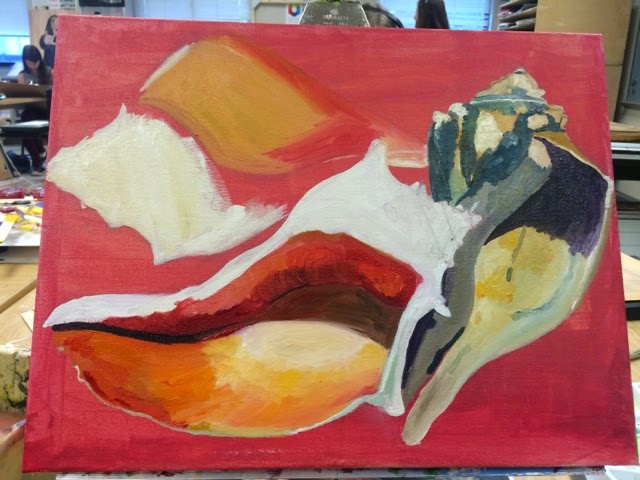
There are still some final touches left, bubbles and fish and the border of our portal to the sea, but here's our current progress.


Wednesday, May 21, 2014

Parallelism Project Morphs in Mural

Instead of working on the parallelism assignment, I'm creating another mural, a project that spun off of our previous chalk mural. While we were working on our chalk mural in the courtyard, a teacher approached us about working on a mural in her room. She teaches computer classes and said that for years she'd been wanting to paint a mural in her room to help make the technology classes more appealing to women. She explained that women make great programmers but they often don't chose that course of study because they feel uncomfortable in that environment/ feel as though they don't belong . Later in the week we went to look at the wall she had in mind and started sketching out our ideas. At first we were thinking about doing a landscape of some sort, but then Hannah suggested something more graphic and bold that would have a larger impact on the space. She found this picture for inspiration. We loved the bright colors and the organic shapes, and plan to also incorporate bubbles and fish to the leafy background. Instead of using the darker hues as our background, we switched to turquoises which girls in the class said were more appealing to them. This past week we started painting the background color of the wall, a mix of three tints of turquoise. We also blocked off the wall to look like a portal to further the illusion of being under the sea.